Glen: a visual system for a small NGO
Logo, visual identity and a communication system for Glen Slovakia, a non-profit global education network, built to stay consistent across web and social.
Build a system, not just a logo
Glen Slovakia needed a clear visual identity it didn't have: something consistent enough to hold together across a website, social posts and a small icon system, run by a non-profit team without a design department behind it.
Design rules the team could apply themselves.
A one-off logo doesn't help a small team publish consistently. The real deliverable was typography, layout, color and icon rules anyone on the team could reuse.
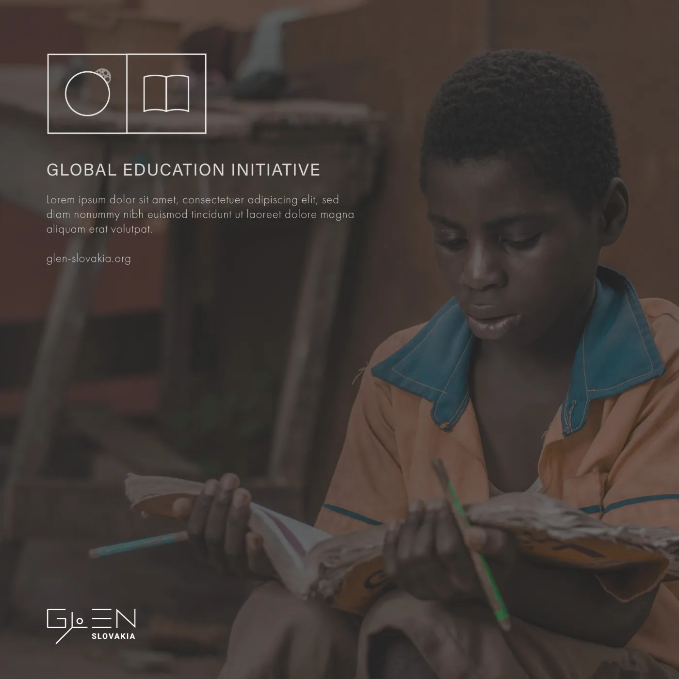
A social template showing the system in use: identity, icon and layout rules applied to a real campaign post.
What I did
I designed the logo and the core identity style: typography, layout rules and color direction that could carry across very different formats, from a website to an Instagram post.
I also created a set of custom icons for navigation and content categories, and communication templates for web and social that keep the same hierarchy no matter who fills them in.
Every asset was prepared to be reusable, so future content stays consistent without a designer involved each time.
Skills this shows
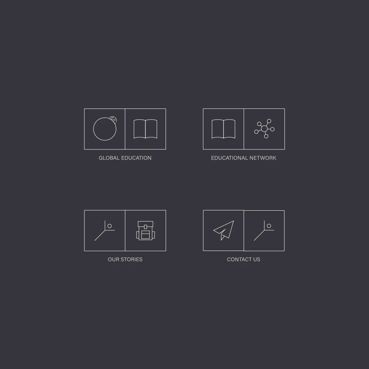
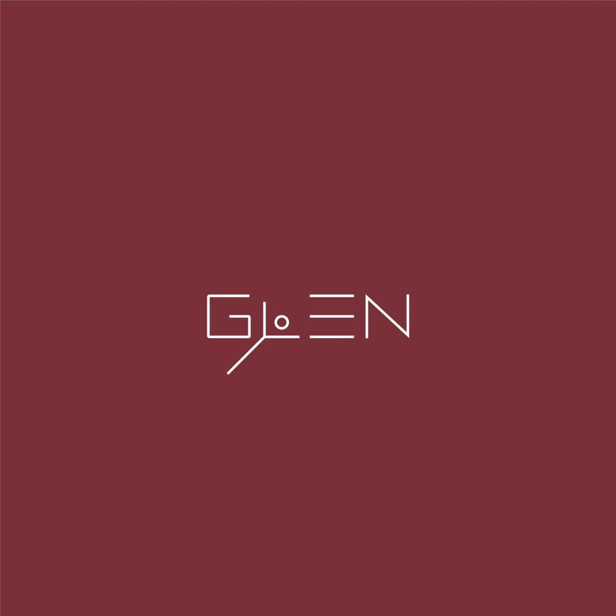
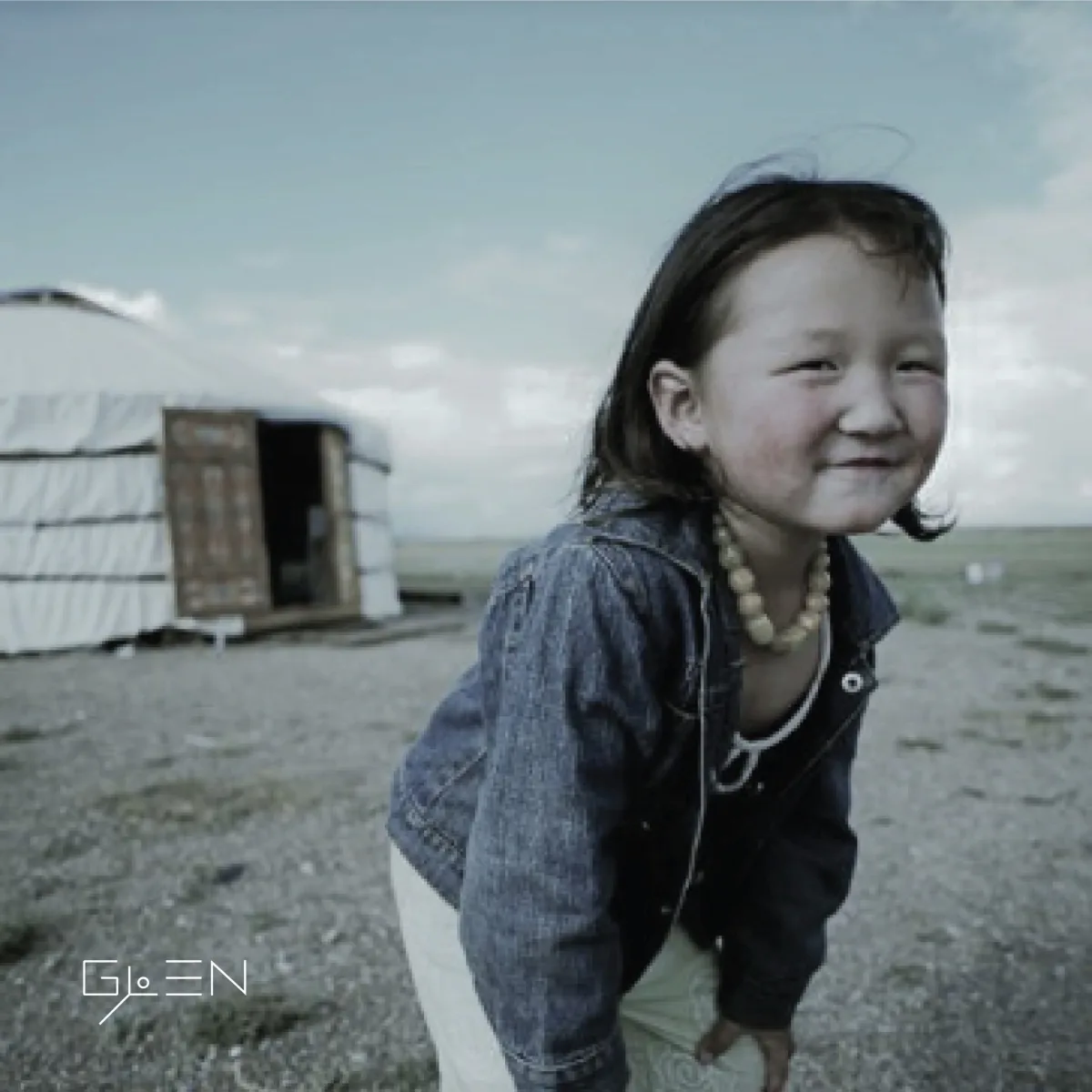
The icon system, the logotype and a second social template. Click to enlarge.
Outcome
A simple identity system that made Glen's communication more consistent, recognisable and easy to maintain across channels.
Have something worth building?
I'm interested in senior product, product design and hybrid leadership roles.